Established in 2005, the National Committee for Addiction Treatment (NCAT) acts as a platform for addiction sector leaders and a champion for employers/services and the workforce.
As part of the project to re-imagine NCAT and how it might support the sector, we have refreshed the NCAT brand identity.
The story remains the same: NCAT exists to amplify the sector’s work, facilitate structural change, and provide advocacy for systemic challenges and opportunities. It is a conduit with media and government, when needed, to address issues members have in common.
However, the brand identity has evolved, building on the functions of NCAT and the symbolism contained withing the brand icon.

connect. Support. amplify.

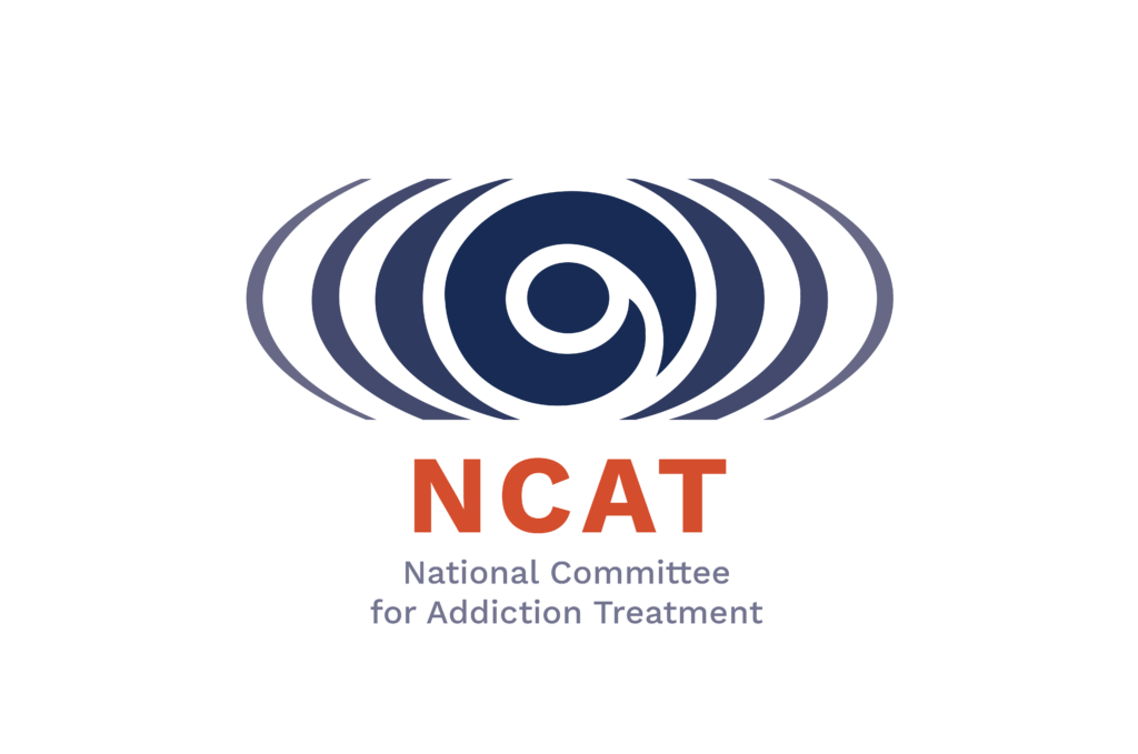
We can see several patterns in the icon or motif used in the NCAT logo that speak to NCAT’S position as an advocate for, connector and supporter of the addiction sector in Aotearoa.

A koru or spiral/ loop pattern can be seen in the centre of the icon.

Referencing an unfolding silver fern frond, the koru is sometimes used to represent new beginnings, or to suggest perpetual movement, and the growth that can come from this.

It is also understood to suggest nurturing and the strength that is derived from familial bonds.

This sense of growth, movement and influence is also suggested by the ripples or sound waves / pulses that emerge from either side of the koru.

If we see the centre as the core, the outer part of the
device is turning up the volume or amplifying the work.
Taken in its entirety, the graphic device can be seen as a strong centre or core, with the outer rings serving to amplify its efforts, and strive for consistent and far-reaching impact.

Across the brand, images have been chosen that build on and reflect the symbolism of the brand icon (e.g. ripples in water, the spread of a fern’s canopy), as well as the nature of NCAT as a network, weaving and connecting different parts of the sector.


